Friday, October 31, 2008

Guerrilla Marketing for Obama: Vending Machine "Change"

It's been a long election season, so needless to say I'm excited to go cast my vote on Tuesday! Which leads me to a very important reminder: GO VOTE ON TUESDAY! We've seen in the past few elections that every vote really, truly counts, so please, regardless of who you're planning to vote for, just get out to the polls on November 4th. It's important, and we are so lucky to have the opportunity to choose our next leader during this difficult time in our nation's existence.

OK, off my soapbox and on to the fun stuff. While I won't get into the politics of either candidate, I will say that from a marketing perspective, Obama's campaign has been a breath of fresh air. Whether you love him or hate him, you must admit that Obama's marketing campaign has been brilliant.

Obama's logo and campaign materials, unlike so many political campaigns before them (and after them, I'm sure) are well designed, not only from a visual standpoint, but also from a branding standpoint. They're patriotic, but also clean and simple, touting "Change" and "Hope" more than the candidate's name, and making these words almost synonymous with "Obama."

To quote a great blog post from earlier this year,


...we are living through the first Presidential campaign that is being marketed like a high-end consumer brand...The typical Presidential campaign logo usually features some variant of the stars and stripes. Beyond patriotism, they have no message. They are pretty much interchangeable between Republicans and Democrats. Obama’s logo rearranges these patriotic elements into an emblem that distills his message to the core: the hope of the sun rising [or, Republicans, is it setting?] over amber waves of grain, with the novelty of the candidate’s unusual last name reinforced in an “O”...And like good corporate logos, this logomark can be disaggregated from the candidate’s name, in the same way that the swoosh instantly screams “Nike” or the circular logos of BMW and Mercedes spark instant associations with affluence and prestige.

There was the viral Yes We Can video:
Yes We Can Obama Song by Will.I.Am


Then there was that 30 minute "infomercial" this week across most major networks with absolutely no mention of his opponent. Not to mention a brilliant Internet campaign including Twitter, Facebook, and an email announcement to subscribers the moment Obama chose his vice presidential candidate. I could go on...

But the item that inspired me enough to actually blog about his campaign was the brilliant guerrilla marketing campaign I read about on Trend Hunter this morning, called "Press for Change." The Press for Change campaign encourages Obama supporters to transform the change buttons on vending machines into a political message for Obama, adding his "O" logo to the button with a "press for change" sticker above it. Genius! Here are some pictures:


Now I'm not condoning vandalism here, nor am I suggesting that seeing the Obama message on a vending machine is going to sway a vote one way or the other, but again, regardless of politics, you must admit that this one is clever, and totally in-line with Obama's brand promise.

I hope that future politicians are taking (marketing) notes from Obama's campaign, and I look forward to seeing how future elections take Obama's strategies one step further as our marketing landscape continues to evolve.

Don't forget to vote on Tuesday. Promise?

Tuesday, October 28, 2008

Eco-Friendly Identity for Precision Digital

As a marketing company striving to be more eco-friendly, it's important to have a strong network of vendors with the same mindset to support the efforts I'm making with my clients. So I was thrilled to team up with SKL Marketing to help Precision Digital, a local display company, develop an identity and marketing materials for their new "green," eco-friendly line of product offerings, and to be able to offer their products to my clients as well.

Precision Digital Greenworks, as we named this new division, offers "green," eco-friendly banners, trade show materials and signage using new products designed to have less of an impact on the environment. Their industry traditionally uses some pretty toxic materials, including vinyl, which takes 500 to 700 years to biodegrade in landfills. Now they offer biodegradable PVC, which only takes 3 to 5 years to biodegrade. This and other similar materials, paired with eco-friendly inks, mark quite a transformation for a display company.

The logo for this new division uses the globe and "Precision Digital" type treatment from their existing logo, while changing to a color palette of lime green and brown and adding a handwritten script for the word "greenworks" to give it an eco-friendly flair.


The tagline I developed for the company, "Transforming the way you display," touts their main brand promise. To quote the brochure we developed, "Just as a caterpillar transforms into a butterfly, Precision Digital is changing something ugly into something beautiful." Likewise, all of their materials feature a monarch butterfly against a vibrant orange background.

Here is the tri-fold brochure, which includes a caterpillar, cocoon and flying butterfly to symbolize the transformation the company is making. It also includes samples of a banner design, banner stand design and sign design.


The business cards also features the Monarch butterfly.


And their temporary website also plays on this concept.


We wish Precision Digital luck as they launch this new product line to the public!

If you're interested in learning more, please contact me and I will coordinate your new eco-friendly banner, trade show materials or signage with Precision Digital.

Polished Identity for Control Logics


Homan Lajevardi has been a client of mine for over a year now, and I was so excited to hear that he was starting his own company a few months back. His new venture, Control Logics, specializes in risk management strategies, including internal controls and audit and Sarbanes-Oxley assistance. And while I certainly don't claim to be an expert on all of the technical details of what he does for his clients, Homan certainly is.

Homan wanted his company's new identity to be very polished and professional. The symbol I developed as part of the logo is made of "C's" and "L's" while still creating a graphic image that stands on its own, both in the circular icon in the logo and as a ghosted graphic element on identity pieces. We added shading and highlights to give the symbol some dimension, and paired it with a clean, sans-serif typeface.

The business cards are very clean and simple...


...and we created electronic letterhead, with templates created in Microsoft Word and Excel.


We wish Homan the best of luck as he creates yet another successful, worldwide company. To learn more about Control Logics, contact Homan at 813-454-2383 or homan@control-logics.com.

Sweet Girly Identity for Elle Diere Sophisticated Baby

I've known Lauren Castine for 8 years now, and she's one of the most creative people I know. Dubbed "Martha Stewart" by all of her friends, Lauren has a knack for making things look beautiful, from homes to parties to weddings to, now, baby accessories. When Lauren became a mom 7 months ago to the lovely Kendall James, it came as no surprise that Kendall would quickly become just as well-dressed as her mom. And since Lauren wanted accessories to match each of her adorable outfits, she started making them herself.

Lauren and I have worked together on many a project since we met, including the identity for her wedding business, Elle Diere Signature Weddings (she and her mom have planned some AMAZING weddings...mine included...and they make beautiful handmade items like ringbearer's pillows and aisle runners)...


and most recently, the birth announcement for her daughter Kendall.


The identity for her new line of accessories, Elle Diere Sophisticated Baby, combines elements from each of these projects. Here are the business cards:


And the product packing for the headbands and hair clips:


Lauren is currently selling the Elle Diere Sophisticated Baby line at Serrano's Maternity in Brandon. View more of her designs here, then contact Lauren at ElleDiere@gmail.com if you'd like to learn more. We can't wait to see what's next!

Monday, October 27, 2008

Visual Website for Exterior Concepts

I've been writing freelance stories for Brandon Magazine (a new upscale magazine for the Brandon area of Florida) for the past few months, and that's where I met David Hetrick, the owner of Exterior Concepts. The latest issue of the magazine features his company as its cover story, so while I was interviewing him for the story, I got to know a lot about what he does. I also found out that he was looking to update the Exterior Concepts website, so I've been working with him on a website redesign.

Exterior Concepts is a full-service hardscape company that creates outdoor living spaces with an artistic twist, resulting in spectacular mixed-medium outdoor living spaces for their customers. Their work is really beautiful (check out the Featured Projects and Gallery on the site), and Dave is a true artist.


The new website really makes their work the star, showcasing all of the beautiful projects Exterior Concepts has done for its customers over the years. There's a slideshow of some of the highlights on their home page...


...and the Gallery showcases a portfolio of each of the different "artistic mediums" that Dave uses in his outdoor living spaces, including custom decks, gazebos, fire pits and water features.


I've really enjoyed working with Dave on both the website and the magazine article, and I hope that his business continues to grow and flourish as more people discover Exterior Concepts. If you want to learn more, visit the website, www.exteriorconceptsonline.com, give Dave a call at 813-877-2792 or email ext.concepts@yahoo.com.

Logo Design for The Marlo Laney Group

Marlo Laney is an enthusiastic, energetic Realtor who just relocated back to Florida after living in Virginia for 11 years.

Since she last lived in Florida she's gotten married and has a new last name, but since the name "Marlo" isn't all that common, we decided to use it to achieve a bit of brand recognition from people who remember her as Marlo Davis. Thus her business in Virginia, The Laney Group, became The Marlo Laney Group in Florida.

As a Realtor, we wanted a symbol for Marlo that would represent what she does (find people homes) without being completely obvious about it. So instead of using a house, we used a skeleton key. Marlo wanted a fluid, feminine script to display her name, and chose a deep red to match the Keller Williams logo she displays on her marketing materials, along with a blueish gray and black.

If you're in the market for a new home, give Marlo a call at 813-846-6328 or email her at marlo_laney@hotmail.com. 78% of her business is referral based, and her customers have said that Marlo has helped them put the fun back into the homebuying process...that they've enjoyed looking at houses, and she made the process less stressful. She really focuses on developing trust with her clients, and always offers them honesty and education.

Welcome back to Florida, Marlo!

Thursday, October 23, 2008

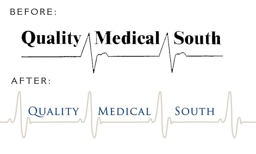
A Refreshed Identity for Quality Medical South

Perceptivity Studio teamed up with Contact Media to create a new identity and marketing materials for Quality Medical South, a biomedical equipment repair and service company.

Quality Medical South liked the concept of their existing logo but it needed a bit of a makeover. We refreshed the heart monitor graphic, type treatment and color palette while still maintaining the integrity of the original design.


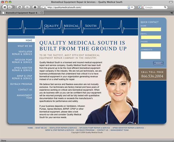
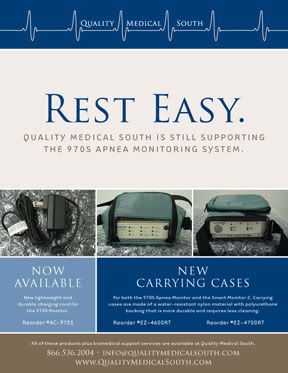
Once the logo had been updated, we worked with them on a new website design and sell sheet design for their individual product lines. The new website, www.QualityMedicalSouth.com, just went live.


The sell sheet design has a similar look and feel to the new website, while presenting the information in a simple, easy to read format.

Wednesday, October 22, 2008

Tampa Bay Green Business Survey

As I've posted before, Perceptivity Studio is trying to be an environmentally-responsible business, and I've teamed up with a few other local Tampa Bay businesses to start a new group called Green Initiative Tampa Bay that will hopefully help me (and you!) do just that.

We're still in the planning process, so we've developed a survey to help us understand how other businesses in Tampa Bay (and elsewhere if you're not local!) feel about "going green" with their businesses with questions involving opinions, eco-friendly business practices and more. I sent a link out to many of you this morning, but if you didn't get it, here's a link to the survey:
http://www.zoomerang.com/Survey/?p=WEB228CHSLD6YQ

The more feedback we can get, the better, so please take a few minutes (it's quick, I promise!) and let us know what you think. I will post more information about the group once we get it going. Thank you in advance for your help!

Tuesday, October 21, 2008

A New Website for Engineering Matrix

Perceptivity Studio has been working with the wonderful team at Engineering Matrix since February. We launched a direct mail campaign to let their current customers know about some of their lesser-known services a few months ago and developed a new "look" for their company in that campaign.

Next up? Revamping their website. While it actually went live a few weeks ago during my crazy-busy blogging downtime, I'm excited to finally blog about it and show you the new site now, because I love it!

Here is the home page...actually, go look at the actual home page so you can see the rollover on the menu. When you roll over each of the menu headings, the "Matrix" in "Engineering Matrix" changes...so About is "Engineering Story," Team is "Engineering People" and so on.


The interior pages follow a similar layout. Here is the team page:


Engineering Matrix is very involved with "green" building. In fact, 25%+ of the staff are LEED Accredited Professionals with the U.S. Green Building Council, which is a big deal! So we did a special page on the new website dedicated to Sustainability ("Engineering Green") and even changed their blue logo to green for this page.


We're also developing a complete admin system so they will be able to edit the website themselves, including adding new projects to the portfolio page (which we're hoping to launch soon so you can see all of the amazing projects they've worked on).

This has been a really fun project to work on, and we look forward to whatever is next with the Engineering Matrix team! If you haven't already, go look at the new website now!

Thursday, October 16, 2008

Perceptivity Studio will be exhibiting at Efest!

Perceptivity Studio has been focusing on eco-friendly marketing with our clients for a while now, and we're excited to take that focus one step further--we'll be exhibiting at this year's Efest in Sarasota on November 15th and 16th.

Efest is "a major green living music and arts festival that unites hundreds of organizations and thousands of individuals that care about our environment," and we're hoping to reach like-minded businesses who are looking to make their marketing efforts more eco-friendly with our green marketing materials (like business cards and brochures), green promotional items (like recycled pens and water powered clocks), green display materials (like banners, signs and trade show materials), electronic media (like websites and email newsletters) and eco-friendly identities (logos that reflect eco-conscious companies).

Want to read more about our eco-friendly, "green" marketing services? Visit our website and click on the "green marketing" button at the bottom of the page. Want to check out Efest? Their website is www.efest.us.

Friday, October 10, 2008

A More Sophisticated Yellow Tag: Best Buy Gets a New Logo

I just read on the Brand New blog this morning that Best Buy is in the process of re-branding themselves with a new, more sophisticated logo. There's quite a bit of debate over at Brand New about whether Best Buy's new logo was a good idea or not, and I'm still a bit undecided myself.

As I said in my comment over there, my initial reaction was positive. From an aesthetic standpoint, the new Best Buy logo is certainly an improvement...from a practical standpoint I'm still making up my mind.

It's certainly hard to ignore the screaming yellow price tags currently adorning all of Best Buy's stores, but will we really not notice the new yellow-outlined tag just because it's not screaming as loud? The big-box Best Buy stores will still probably be painted bright blue, and the yellow is still there, just not "highlighter" yellow. I'm guessing the new Best Buy signs will all be in neon, a la the photos from the new Mall of America storefront where the new logo was launched.

It's still going to be obvious that this is Best Buy, and I don't think people will notice them less because of their new logo.

In our Great Logo quiz back in May, Best Buy was one of the logos we looked at. Here's what I had to say back then:

This logo has been around since 1989, and literally screams the company's main benefit (you will get the "best buy" by shopping here) loud and clear in eye-catching yellow and black. In Best Buy's highly competitive retail environment, this bold color combination may be a good idea. However, just because it's bold doesn't mean people will automatically pay attention, so think about colors that make sense for your company before automatically picking the loudest ones.

I said it then and I say it now. Maybe it's not such a bad idea to stop screaming at your customers. Let's see how Best Buy's new logo plays out once it's officially launched.

Tuesday, October 7, 2008

A New Logo for Natural Baby Source

Betty Cortez is super-mom. With a handful of kids and a handful of entrepreneurial conquests, she talks a mile a minute and is constantly on the go, go, go every time I see her. So it's no surprise that she's saving the world one cloth diaper at a time with her new company called Natural Baby Source, which sells eco-friendly baby products like cloth diapers to moms around the country.

Natural Baby Source tapped Perceptivity Studio to design a new logo for their revamped e-store, tasking us to come up with something that was fun and whimsical while still projecting a professional image to customers and emphasizing that the company focuses on "green" products. Given our commitment to eco-friendly marketing and the "green" movement in general, we were excited to work with a company whose main goal was providing eco-friendly alternatives to families.


The logo that Betty chose features a baby hanging from a tree in a green sling. It's sweet and simple, and looks great on the website that Betty had already put together for the company. The new identity and e-store look very tailored and professional and really make Natural Baby Source stand apart from their competitors.


We're glad to have been able to help Natural Baby Source develop a professional identity to differentiate their company, and we look forward to hearing updates on Betty's success with this and other projects.

To learn more about Natural Baby Source and the whole cloth diapering phenomenon (which is a whole lot less scary than it sounds!), visit their website, or contact Betty Cortez at betty@naturalbabysource.com.

Monday, October 6, 2008

Long time, no blog!

The good news is that I've been very busy here at Perceptivity Studio. The bad news is it's been nearly a month since I've blogged! In that month, we've wrapped up a lot of really great projects for our clients, so I'm going to make a real effort to post some of that work...soon, I promise!