
Blogging has certainly taken a back seat to the new projects we've been working on at Perceptivity Studio, but I wanted to take a quick second to point out one of the best commercials I've seen in a while: AT&T's "Lost Dog" spot, which is currently running.
I think I've mentioned before that I watch most of my television on DVR and zap through the commercials (I know, I know, I should be more loyal to my industry!) to save time. But as we were fast forwarding the other night, my husband actually told me to stop and watch a commercial, a very rare occurrence. It was the AT&T "Lost Dog" spot, which features a little girl putting up posters looking for her lost puppy with UNC basketball star Tyler Hansbrough saving the day with his AT&T phone and the power of social networking. Entertainment Weekly also took notice of this tearjerker in their PopWatch blog today.
The spot is great because it really does strike a chord with its target market. This sort of "viral" everyday information swap has become a daily occurrence for most of us these days. Need some information? Jump on Facebook or Twitter and you're likely to find someone who can get you what you're looking for...whether it's your lost dog, a book recommendation, a business resource or pretty much anything else your heart desires, and it comes personalized just for you by someone you know in some context.
Now with mobile devices like the ones AT&T is touting, these social networking tools are becoming more and more accessible...and some would say ubiquitous. While I've resisted the mobile web for a few years now (because really, I check my email too frequently already!), I know the day is coming when I won't be able to resist the call of a shiny new Blackberry and its ability to instantly gratify my every wish and whimsy. And this commercial is doing its job to encourage me to hurry that process along.
Friday, September 25, 2009
Thursday, June 25, 2009
The new Namics logo: boring revamp...or is it?
I read about the new Namics logo in the Brand New blog this morning, and I instantly wondered what the heck they were doing when I saw the before and after (photo from Brand New):

The original Namics logo, while a little bit odd, at least had some character to it. And they replaced it with a bunch of words set in Arial?? Seriously?
But once I read the background behind the new Namics logo (you can read more about it in the Brand New article if you're interested), dubbed by Heads, the agency who created it, as “the world’s first ‘Real Time Corporate Identity'” I appreciated its genius. While I don't understand what the German words before the Namics name mean, they're actually being pulled real-time from input by Namics employees through any number of methods, like Twitter or SMS. Confused? Visit the Namics website and watch the logo continually refresh itself. It's a random stream of consciousness...ever-changing and reflecting trends in the online world.
Despite my initial reaction, I think this is one of the most intuitive logo ideas I've seen in a long time. It is able to reflect a consistent brand image for Namics while still staying fresh and new at all times. Brilliant.
Wednesday, April 8, 2009
The Bronze Quill
I mentioned a few months ago that Perceptivity Studio and Bacon Group, Inc. had won two Bronze Quill Awards of Excellence from the IABC. While Bacon Group kept the original awards, I ordered one for Perceptivity Studio, and it just came yesterday. Thought you would enjoy looking at our pretty new award! (It's a little hard to photograph, since it's clear, so apologies for the bad picture!)

Stay tuned for a post about the new campaign we just launched for Bacon Group's new pre-designed shelter line, called S3 Shelters. If you'd like a sneak peak, visit the temporary website at S3Shelters.com where you can view a slideshow of their beautiful work and enter to win a $50 Visa gift card.

Stay tuned for a post about the new campaign we just launched for Bacon Group's new pre-designed shelter line, called S3 Shelters. If you'd like a sneak peak, visit the temporary website at S3Shelters.com where you can view a slideshow of their beautiful work and enter to win a $50 Visa gift card.
Friday, March 6, 2009
An Eco-Friendly Identity for PURE Inspired Design
Designing the eco-friendly identity for PURE Inspired Design was an ideal job for Perceptivity Studio. Part green, part fun & modern, I am so happy with what we came up with for this new company!
Interior Designer Samantha Cobos, an established interior designer in the Minneapolis-St.Paul area, became so interested in "green" interior design that she decided to start a new company dedicated solely to environmentally conscious interior design. PURE Inspired Design will officially be launching to the public in the next issue of SPACES Magazine, and we've been busy shaping the identity for its public unveiling.
We started with the logo design for PURE Inspired Design, which has a modern, organic feel with bright colors dominated by a vibrant lime green to signify that this is a "green" company.

The business cards came next, and the two-sided design features the company's tagline, Environmentally Conscious Interior Design, across the back on a bold, green background. We printed the PURE Inspired Design business cards with a green printer, using 100% post-consumer fiber recycled paper.

As I mentioned before, the company will officially be launched in the next issue of SPACES Magazine, and we created a full-page ad to introduce the company. Readers are already familiar with Samantha's existing interior design business, INTERIORS by Samantha Cobos, so we used the same picture so they would recognize her face, and explained why she started the new company. Future ads will feature her exclusive line of eco-friendly furniture and rugs, which are currently in development, but the main purpose of this ad was to draw a connection between "environmentally conscious" and "interior design" which we did with the various images in the ad. The Robin's nest image was perfect, since many people associate a "nest" with their home, and the blue eggs perfectly picked up on the turquoise in the logo.

Finally, we developed a fun website for PURE Inspired Design. The home page features the same images as the ad for brand recognition, and the site also features a portfolio of Samantha's interior design work and a product gallery of the furniture and rugs she is currently developing. Visit the site, www.pureinspireddesign.com, to see more, and to learn more about this awesome new company.
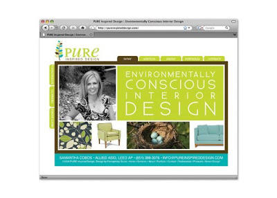
While PURE Inspired Design is currently operating in the Minneapolis-St.Paul area, they will also be offering a "virtual" interior design service worldwide in the near future. We wish Samantha Cobos and PURE Inspired Design the best of luck as the company is launched next month. Thank you for letting Perceptivity Studio build your new identity!
Interior Designer Samantha Cobos, an established interior designer in the Minneapolis-St.Paul area, became so interested in "green" interior design that she decided to start a new company dedicated solely to environmentally conscious interior design. PURE Inspired Design will officially be launching to the public in the next issue of SPACES Magazine, and we've been busy shaping the identity for its public unveiling.
We started with the logo design for PURE Inspired Design, which has a modern, organic feel with bright colors dominated by a vibrant lime green to signify that this is a "green" company.
The business cards came next, and the two-sided design features the company's tagline, Environmentally Conscious Interior Design, across the back on a bold, green background. We printed the PURE Inspired Design business cards with a green printer, using 100% post-consumer fiber recycled paper.

As I mentioned before, the company will officially be launched in the next issue of SPACES Magazine, and we created a full-page ad to introduce the company. Readers are already familiar with Samantha's existing interior design business, INTERIORS by Samantha Cobos, so we used the same picture so they would recognize her face, and explained why she started the new company. Future ads will feature her exclusive line of eco-friendly furniture and rugs, which are currently in development, but the main purpose of this ad was to draw a connection between "environmentally conscious" and "interior design" which we did with the various images in the ad. The Robin's nest image was perfect, since many people associate a "nest" with their home, and the blue eggs perfectly picked up on the turquoise in the logo.

Finally, we developed a fun website for PURE Inspired Design. The home page features the same images as the ad for brand recognition, and the site also features a portfolio of Samantha's interior design work and a product gallery of the furniture and rugs she is currently developing. Visit the site, www.pureinspireddesign.com, to see more, and to learn more about this awesome new company.
While PURE Inspired Design is currently operating in the Minneapolis-St.Paul area, they will also be offering a "virtual" interior design service worldwide in the near future. We wish Samantha Cobos and PURE Inspired Design the best of luck as the company is launched next month. Thank you for letting Perceptivity Studio build your new identity!
Wednesday, February 18, 2009
Stinky Cheese: The $50 Logo Experiment
 I read about the $50 Logo Experiment this morning on the Logo Design Love blog and just had to share it with you!
As many of you may know, there are a lot of online logo design companies out there who promise to basically move mountains for mere pennies, giving you custom logo designs at bargain basement prices with un-heard-of turnaround times. It's kind of scary at times for designers like me, because why would you want to work with my company when you could go to one of them for much less?
Well this post is a perfect example of why it would behoove you to run screaming from these logo companies. I always wondered what kind of work these companies produced, and this blogger's experience gave me quite a laugh. That cheese character is just priceless!
The morals of the story?
1. Make sure your designer gets to know you first. There are a lot of logo designers out there. Whether you choose to work with my company or not, make sure the designer you choose is concerned about getting to know your business before they dive head-first into Illustrator. At Perceptivity Studio, we go through our Perception Brief with our clients before starting a logo design, which helps us get to know what makes your business tick, what you like, what you don't like and so on. We've found that it's much easier to get things right the first time around when there's a rationale to go on.
2. Don't nickel and dime your designer. Logo design is a very time-consuming process if you're doing it right. When I design logos for my clients, choosing a typeface alone can take hours as I sort through thousands of fonts in my collection to find several options that will work for a logo, not to mention creating several graphic images that will represent the company (and what they represent) well. Assuming that sweat-shop labor is still illegal, give your designer the budget they need to properly allocate the amount of time it takes to give you some great logo options to choose from.
3. You get what you pay for. If you do decide to go with one of the online logo design companies, you very well might end up with a logo you love. But you're more likely to end up with some stinky cheese.
A company's logo is such an important part of its identity, and I absolutely love working with companies to design or even re-design their logos. Thank you to all of the companies who've trusted Perceptivity Studio to establish their brands. I hope the process was worth more than $50! :)
Monday, February 2, 2009
The Perceptivity Studio Super Bowl XLIII Ad Awards
 I'm not the biggest football fan unless we're talking about the Florida Gators, so I really wasn't all that excited for the Super Bowl last night. At least not about the actually football game part of it, (which really didn't end up being all that bad). I was, however, totally psyched for what I consider to be the main event of Super Bowl Sunday, and I know I'm not alone here...the ads.
Ah, those :30 and :60 budget-busters that all the advertising nerds like me look forward to each year. Honestly, during the actual game, which I watched from the comfort of my couch with my husband, I had my book out and got some reading time in, but as the music signaled a commercial break approaching, I put down my book, got out my notepad, and got ready for some great commercials.
According to USA Today, about 28 advertisers bought a record $206 million dollars' worth of commercial time. They paid a record $3 million per 30-second slot — or $100,000 a second — for their moment of Super Bowl glory. Nearly 100 million viewers nationally watched at least some part of the game and its 52 commercials.
Now normally, I would scoff at spending that amount of money on one commercial. But these days, it might not be the worst idea in the world. Super Bowl ads have always been popular, true, but these days, think how many people (myself included) are blogging about them, posting/watching the YouTubes, watching them on Hulu, etc. etc. Sure you paid for one :30 spot, but in these days of Tivo, it just might be one of the few times you can get people to not only watch your ad once, but watch it again and again and share it with their friends and colleagues. That being said, you won't be seeing a Perceptivity Studio Super Bowl spot anytime soon, but it does rationalize that ridiculous $206 million number just a bit more than it used to.
But I digress. Despite the huge budgets, I wasn't terribly impressed this year. Sure there were a few good commercials, but I don't think that any of this year's ads will make the all-time best list. So in lieu of recapping all of them, I've decided to give out my awards for the best and worst of the night. If you want to see more, Hulu has them all posted:
The Perceptivity Studio Best in Show: Coca Cola's "Heist"
This one isn't getting the best reviews out there, but I really loved this sweet Coke ad that featured a gang of insects absconding with a sleeping picnicker's Coke bottle to the music of Peter and the Wolf. Was it the most effective ad? Definitely not. But it made me smile, and it was the one ad that I personally will remember from this Super Bowl.
Runner Up: Monster.com's "Double Take"
This one is getting good reviews, and I really enjoyed it as well. The plight of the everyman in corporate America with the snooty, good for nothing boss is dramatized by showing the boss in his pristine over-the-top office with a large moose head mounted on the wall, then taking us around the other side of the wall where the moose's other end hovers above some poor Joe's desk. Not sure it's the most timely of messages (because really, if you have job security right now, who cares if you have a moose a** above your desk!), but still a good one.
Most Timely Message: Hyundai's "Contract"
On the flip side, the Hyundai "Contract" spot was not all that memorable or special, but its message will probably be very effective for them. Buy a Hyundai, and if you lose your job, return it with no adverse affect to your credit. With the economy in a less than favorable state right now, this just might make more people consider buying a Hyundai. And their Hyundai Genesis "Angry Bosses" spot made me giggle a bit too, noting that "winning one little award will suddenly make everyone get your name right (it's Hyundai, like Sunday)." Their spots averaged out to a good mix of humor and concern.
Runner Up: E*Trade's "Wings"
Acknowledging the bad economy, E*Trade welcomes people to use their service to "learn to fly again." I'm not a big fan of the talking babies though, so despite the good timing, I didn't love this one. But after re-watching it a few more times, I must admit the cute little singing baby is growing on me!
Biggest Laugh: Doritos "Crystal Ball"
This one wasn't created by the pros, it was created by two unemployed brothers, who won $1 million from Doritos for winning an online contest and ended up creating the best-liked ad in the Super Bowl according to the USA Today Ad Meter. Was it the best ad? No. It relied on the old slapstick "getting hit in the crotch" shtick that has happened in many Super Bowl ads before it. But despite its cliche humor, you have to admit this one was funny. And honestly a bit scary for my industry!
Lamest Attempt at Humor: Castrol Oil "Edge Monkeys"
Who decided that chimpanzees were so funny? Funny monkeys are another Super Bowl stand-by, but this one didn't work quite as well for me. Grease monkeys, haha, get it? And the gratuitous monkey kiss at the end? Yuck.
Runner Up: Pepsi's "Pepsuber"
While SNL was fantastic during the election, it's not doing so well outside of the fantastic Tina/Sarah impersonation. This one was just lame, and a big disappointment considering how good Pepsi's ads have traditionally been.
Most Amibivalent Reaction: Pepsi "Refresh Anthem"
While it was decidedly better than "Pepsuber" I'm still a bit undecided on the "Refresh Anthem" ad. Is Will.i.am really the Bob Dylan of our generation? Sure I loved his "Yes We Can" Obama video, but I don't know if I agree with that comparison, though some of the other then-now comparisons were quite good. The jury's still out on this one. I think Pepsi missed a big opportunity to really show off their new branding.
Biggest Letdown: Budweiser Clydesdales
The Budweiser Clydesdales have been a standard for good Super Bowl ads in years past, and I just wasn't all that impressed with this year's trio of horsey goodness, which tried to be a bit too cute for my taste. Of the three, "Circus" was probably the best, though it reminded me more of the Britney Spears music video of the same name than it tore at my heartstrings. Maybe next year will be better for the Clydesdales, but until then, I will leave you with the unforgettable 2002 "Respect" spot, which still brings tears to my eyes.
So what did you think? What were your favorites? Least favorites? Were you disappointed with the overall quality of this year's commercials like I was? Leave a comment and let me know!
Friday, January 23, 2009
A bit of advertising history: famous logos and Super Bowl Commercials
Things have gotten very busy again at Perceptivity Studio. Not that I'm complaining in the least, but it's made my blogging become a bit scarce! I really do plan to get some of the fun new projects we've been working on up here soon, but in the meantime, here are a few websites where you can go kill some time learning about the history of advertising.
1. Stories Behind 10 Famous Food Logos
Sure you recognize them in the grocery store, but do you know how these famous icons came to be? Get to know more about the Morton Salt Girl, Jolly Green Giant, Sara Lee, Quaker Oats and the Laughing Cow, find out where Heinz 57 came from, and find out which two of these four icons are real people and which two were dreamed up by creative advertising geniuses: the Gerber baby, Aunt Jemima, Chef Boyardee and Betty Crocker. I love seeing how brands have evolved over the years but still maintained a sense of brand equity so you and I will still recognize them.
2. The Adland Archive of Super Bowl Commercials
While most years I honestly couldn't care less about the football teams playing in the Super Bowl, I most certainly do care about the famous Super Bowl commercials! Super Bowl commercials are notoriously the best commercials you'll see all year, and companies spend humongous amounts of money to make sure their spots will be the ones talked about. (This year the starting cost for a :30 Super Bowl commercial is reportedly up to $3 million dollars, not to mention the production costs to put together that :30 spot. What would you do with that kind of marketing budget?)
Anyway, here is an archive of all of the notable Super Bowl commercials from years past. My all time favorite Super Bowl commercial? The Apple 1984 commercial from, not surprisingly, the year 1984. It's a classic and gives me chills every time I see it. Not to mention it launched Mac computers! Here's a bit of history on the Apple 1984 commercial:
The Apple 1984 commercial was created by the advertising agency Chiat/Day, and Ridley Scott (who had recently finished filming Blade Runner) was hired to direct it with the "unheard-of production budget of $900,000." Steve Jobs loved the spot, so they purchased commercial spots in the upcoming Super Bowl. In December 1983 they screened the 1984 commercial for the Apple Board of Directors, and reportedly the entire board hated it. It almost got pulled in favor of a much safer but much less impactful spot, but thankfully it did run and the rest is history. To read more about it, there's a great article here.
The Apple 1984 commercial is embedded below, enjoy!
Thursday, January 8, 2009
Ikea brings holiday spirit to their billboards
With billboard design, sometimes it's hard to step outside the box, or in this case, the rectangle. There are so many restrictions...making sure that you don't have too many words (because you sure don't want your potential customers to crash their cars!), that your text is readable from a distance, that your message is easy to grasp in just a few seconds, etc.
 Some companies get their billboards very, very wrong, but there are a few that always stand out for me, getting their billboard designs very, very right. Like the Chick-fil-A cow billboards. You've seen them...three dimensional cows stand below the board promoting "chikin." Genius!
And I just saw these three-dimensional, holiday-specific billboard designs from one of my favorite places...Ikea! If you haven't been to Ikea, you're totally missing out on a zen-like experience...two gigantic stories of low-cost, but totally stylish furniture and home accessories. But I digress...Ikea has done some great advertising over the years, like the award-winning Ikea Lamp commercial, which I'll embed at the bottom of this post if you haven't seen it. Ikea continues the trend with these fantastic billboard designs, which feature the words Joy, Hope and Love made from families enjoying the holidays with their Ikea furniture. The simple copy at the bottom says "Decorate for the holidays." Which of course has a double meaning, so brilliant!


Now get our your tissues for the Ikea Lamp commercial. This message totally speaks to me, because I'm one of those sentimental fools who gets attached to inanimate objects. Enjoy!
Wednesday, December 24, 2008
10 things I didn't have growing up, but couldn't function without now
As part of GenY, I'm a bit obsessive about my technology. I check my email far too frequently, never leave home without my cell phone, and DVR way too many shows. As I was driving down the highway yesterday, I started thinking about all of the things that I'm now so intertwined with I would go into withdrawal if they were taken away, and yet everything on that list is a relatively recent addition to my life. So I thought it would be fun to make a list of the things I I didn't have growing up, but couldn't function without now. These are in no particular order because I tried to rank them, but couldn't! :)
 Cell Phone: I'm not half as high-tech here as I could be, but my aging pink Razr is one of my nearest and dearest friends. It goes with me wherever I go, and even sits on my nightstand when I sleep, where it also functions as my alarm clock when I actually need it (my four cats take care of waking me up these days). It also serves as my business phone, so my clients are able to reach me even when I'm out and about. I've been debating whether or not to upgrade to a Crackberry or another of the smart phones, but know that as obsessively as I check my email now, that could be a very dangerous thing indeed! Which leads me to...
Email: While I'm always glad to talk to my clients on the phone (friends and family too), I am a huge fan of email. It gives me a record of everything I need to do in an easily accessible location, and with a few clicks and searches, I can generally find any information I've ever received from a client. Ask me two years later to find some notes I scribbled during a phone conversation and it's questionable (but still likely) that I'll be able to track them down. But the email from two years ago is still safely filed in that client's folder in Entourage. I've had email for quite some time now...my family first signed up for Prodigy (an old school internet service provider) when I was in middle school. I still remember my first email address (KNFJ75B@prodigy.com...and no, I didn't pick that snazzy succession of letters and numbers) and am still friends with one of my penpals that I met on Prodigy way back in 7th grade (Hi Kristen!)...and yes, we met online, but then proceeded to actually write each other real letters...how quaint, right? We also had a 2400 BPS modem that plugged in to the phone jack and a cord stretched across to our computer...dial-up of course. Which leads me to...
 High-Speed Internet: 2400 BPS dial-up was SLOW, and painfully so. Of course I didn't realize that back then, but as technology started picking up speed it became painfully obvious just how slow it was. Now with my super-speedy Fios, everything online is pretty much instantaneous, which is perfect for an admittedly impatient me. Which leads me to...
Computers: Like I said, my family got a computer pretty early on, so I'm not sure if this officially belongs on the list, but comparing my computer today to that first computer is such a drastic contrast that it pushed it over the edge. While I used PCs for a very long time, my career in design necessitated a jump to Mac, and I will never go back, as they say. I spend a lot of time with my MacBook, which I have docked to a big flatscreen monitor, speakers and my tablet/mouse, but I can still take it with me when I'm out and about, which is the perfect solution for me. Which leads me to...
 WiFi: While this isn't a perfect science yet, I love that I can take my laptop just about anywhere and find a connection to check my email, look something up or kill some time. Airports, restaurants, coffee shops, hotels, check, check, check and check. And even in my home office, I'm not actually wired in. I can work at my desk (where I can usually be found since that big monitor comes in handy) or unplug and sit on the couch or on the back porch just as easily. Which means that information is almost instantaneously accessible wherever I go. Which leads me to...
Google: How did we survive without Google? Seriously. I would guess that at least 50 times a day (which may be a conservative guess), I open Google and search for something, whether it's specific vendors I'm looking for, directions I need (Google Maps), random facts, research I need, etc. etc. etc. And I'm sure you do the same. We all do, which is why Google is so huge. And in addition to the traditional search engine, there are other fun features. Which leads me to...
 Google Reader/Blogs: I read a lot of blogs. I think at last count I was over 75, which includes a mix of marketing information, entertainment news, updates from friends, and random info including cat blogs and my new favorite, Cake Wrecks, which has hilarious commentary on poorly decorated cakes. (Totally random, but great for a good laugh when I need a quick break!) I used to have all of these blogs bookmarked and have to go check them to see if anything new was posted (I read fewer blogs at this point!), and then I discovered the magic of RSS. I now subscribe to all of these blogs in my Google Reader, and it magically tells me every time there's a new post. I don't even have to go to the blogs to read them (unless I want to read the comments, but hey, maybe they'll fix that soon), I just click through them right from the Reader interface. (If you don't have an RSS reader set up and you read more than this blog, go do it right now!) When I write in my blogs, the posts automatically show up in my Google Reader and on Facebook, which leads me to....
Social Networking: Before the internet, if you had long-lost friends, they generally stayed long-lost. But since the advent of social networking, I've been able to find nearly all of the friends I'd lost touch with, including my elementary school friends from South Carolina, middle school friends from before I was rezoned, high school friends before the reunion and college friends to network with now that we're all out in the real world. It started with MySpace, but now I'm an avid Facebooker, and it's made it so much easier to keep in touch with my friends and even my family. I'm reminded of their birthdays, get to see pictures of their kids and lives in general, know what they're currently doing, and can easily check in to say hi or comment on any of the previously mentioned items. Facebook stays open on my computer all day, which leads me to...
 Digital Music: Just like the ubiquitous Facebook, my iTunes is always playing in the background on my computer, on shuffle of course. I love music and have a large, eclectic library of music stored on my computer and on my MP3 player. Do I have CDs? Yes, but the last one I actually purchased was from a long time ago, and most of the ones I occasionally listen to are burned compilations of various artists. At home, it's a mix of everything on iTunes, and at the gym, my MP3 player has upbeat songs to motivate me. In the car, it's usually still the plain old radio, but hey, we can't be high-tech all the time, can we? Which leads me to...
DVR: Live television. I realize that as a member of the advertising community I should watch it, but since we got our first DVR a few years back, I very rarely do. We record an ungodly number of shows between the two DVRs in our house, and we watch them all on our own time. "What did she say?" I just rewind it to find out. Phone ringing? Pause. While there are still a few shows I watch live (LOST!), I couldn't even tell you when most of the shows I watch are actually on, because I watch them all after the fact. When I was little, I called our very basic cable box the "Fraggle Box" because I knew that when I pushed a button, it would put my favorite show, the Fraggles, on the TV for me. My DVR is one smart Fraggle Box.
So there we are. A ridiculously long post about my technological must-haves, and probably too much insight into my technologically obsessive life. So tell me...what did I miss? What are your favorite old-school technology memories? How many blogs do you read? Leave a comment and let me know!
 Cell Phone: I'm not half as high-tech here as I could be, but my aging pink Razr is one of my nearest and dearest friends. It goes with me wherever I go, and even sits on my nightstand when I sleep, where it also functions as my alarm clock when I actually need it (my four cats take care of waking me up these days). It also serves as my business phone, so my clients are able to reach me even when I'm out and about. I've been debating whether or not to upgrade to a Crackberry or another of the smart phones, but know that as obsessively as I check my email now, that could be a very dangerous thing indeed! Which leads me to...
Email: While I'm always glad to talk to my clients on the phone (friends and family too), I am a
 huge fan of email. It gives me a record of everything I need to do in an easily accessible location, and with a few clicks and searches, I can generally find any information I've ever received from a client. Ask me two years later to find some notes I scribbled during a phone conversation and it's questionable (but still likely) that I'll be able to track them down. But the email from two years ago is still safely filed in that client's folder in Entourage. I've had email for quite some time now...my family first signed up for Prodigy (an old school internet service provider) when I was in middle school. I still remember my first email address (KNFJ75B@prodigy.com...and no, I didn't pick that snazzy succession of letters and numbers) and am still friends with one of my penpals that I met on Prodigy way back in 7th grade (Hi Kristen!)...and yes, we met online, but then proceeded to actually write each other real letters...how quaint, right? We also had a 2400 BPS modem that plugged in to the phone jack and a cord stretched across to our computer...dial-up of course. Which leads me to...High-Speed Internet: 2400 BPS dial-up was SLOW, and painfully so. Of course I didn't realize that back then, but as technology started picking up speed it became painfully obvious just how slow it was. Now with my super-speedy Fios, everything online is pretty much instantaneous, which is perfect for an admittedly impatient me. Which leads me to...
Computers: Like I said, my family got a computer pretty early on, so I'm not sure if this
 officially belongs on the list, but comparing my computer today to that first computer is such a drastic contrast that it pushed it over the edge. While I used PCs for a very long time, my career in design necessitated a jump to Mac, and I will never go back, as they say. I spend a lot of time with my MacBook, which I have docked to a big flatscreen monitor, speakers and my tablet/mouse, but I can still take it with me when I'm out and about, which is the perfect solution for me. Which leads me to...
 WiFi: While this isn't a perfect science yet, I love that I can take my laptop just about anywhere and find a connection to check my email, look something up or kill some time. Airports, restaurants, coffee shops, hotels, check, check, check and check. And even in my home office, I'm not actually wired in. I can work at my desk (where I can usually be found since that big monitor comes in handy) or unplug and sit on the couch or on the back porch just as easily. Which means that information is almost instantaneously accessible wherever I go. Which leads me to...
Google: How did we survive without Google? Seriously. I would guess that at least 50 times a
 day (which may be a conservative guess), I open Google and search for something, whether it's specific vendors I'm looking for, directions I need (Google Maps), random facts, research I need, etc. etc. etc. And I'm sure you do the same. We all do, which is why Google is so huge. And in addition to the traditional search engine, there are other fun features. Which leads me to...
 Google Reader/Blogs: I read a lot of blogs. I think at last count I was over 75, which includes a mix of marketing information, entertainment news, updates from friends, and random info including cat blogs and my new favorite, Cake Wrecks, which has hilarious commentary on poorly decorated cakes. (Totally random, but great for a good laugh when I need a quick break!) I used to have all of these blogs bookmarked and have to go check them to see if anything new was posted (I read fewer blogs at this point!), and then I discovered the magic of RSS. I now subscribe to all of these blogs in my Google Reader, and it magically tells me every time there's a new post. I don't even have to go to the blogs to read them (unless I want to read the comments, but hey, maybe they'll fix that soon), I just click through them right from the Reader interface. (If you don't have an RSS reader set up and you read more than this blog, go do it right now!) When I write in my blogs, the posts automatically show up in my Google Reader and on Facebook, which leads me to....
Social Networking: Before the internet, if you had long-lost friends, they generally stayed
 long-lost. But since the advent of social networking, I've been able to find nearly all of the friends I'd lost touch with, including my elementary school friends from South Carolina, middle school friends from before I was rezoned, high school friends before the reunion and college friends to network with now that we're all out in the real world. It started with MySpace, but now I'm an avid Facebooker, and it's made it so much easier to keep in touch with my friends and even my family. I'm reminded of their birthdays, get to see pictures of their kids and lives in general, know what they're currently doing, and can easily check in to say hi or comment on any of the previously mentioned items. Facebook stays open on my computer all day, which leads me to...
 Digital Music: Just like the ubiquitous Facebook, my iTunes is always playing in the background on my computer, on shuffle of course. I love music and have a large, eclectic library of music stored on my computer and on my MP3 player. Do I have CDs? Yes, but the last one I actually purchased was from a long time ago, and most of the ones I occasionally listen to are burned compilations of various artists. At home, it's a mix of everything on iTunes, and at the gym, my MP3 player has upbeat songs to motivate me. In the car, it's usually still the plain old radio, but hey, we can't be high-tech all the time, can we? Which leads me to...
DVR: Live television. I realize that as a member of the advertising community I should watch it,
 but since we got our first DVR a few years back, I very rarely do. We record an ungodly number of shows between the two DVRs in our house, and we watch them all on our own time. "What did she say?" I just rewind it to find out. Phone ringing? Pause. While there are still a few shows I watch live (LOST!), I couldn't even tell you when most of the shows I watch are actually on, because I watch them all after the fact. When I was little, I called our very basic cable box the "Fraggle Box" because I knew that when I pushed a button, it would put my favorite show, the Fraggles, on the TV for me. My DVR is one smart Fraggle Box.
So there we are. A ridiculously long post about my technological must-haves, and probably too much insight into my technologically obsessive life. So tell me...what did I miss? What are your favorite old-school technology memories? How many blogs do you read? Leave a comment and let me know!
Thursday, December 11, 2008
Top 10 Holiday Eco-Tips
 How scary is this? An estimated 2.6 billion holiday cards are sold each year in the United States, enough to fill a football field 10 stories high. It is estimated that between Thanksgiving and the New Year an extra million tons of waste are generated nationwide each week. In fact, 38,000 miles of ribbon alone is thrown out each year--enough to tie a bow around the earth!
Needless to say our society tends to get more than a bit wasteful when December rolls around. Since being environmentally friendly is very important at Perceptivity Studio, I did some research to find out how I could be more "green" during the holidays. I decided to share this information in our holiday card this year to encourage our clients, associates, friends and family to join my efforts, and thought that those of you whose addresses I didn't have might still enjoy reading them!
Here are our top 10 holiday eco-tips for a greener Christmas:
10. Consider purchasing a live tree from a local Christmas tree farm and then planting it in your yard. It’s beautiful during the holidays, and then you get to watch it grow!
9. Give gifts that can be experienced, like tickets to a baseball game or a homemade dinner, to minimize waste from wrapping gifts.
8. Find out what services your family and friends are already using and pre-pay for them as a gift, like a month at their gym or their Netflix subscription.
7. If it’s time to replace your holiday lights, consider replacing them with LED lights—they’re 90 percent more efficient than traditional incandescent lights.
6. For holiday dinners and parties, use non-disposable utensils and dishes to reduce waste.
5. Save your gift boxes, ribbon and even wrapping paper each year and reuse them. If it can’t be reused, separate the leftovers and recycle what you can.
4. Instead of using traditional gift bags to wrap presents, buy reusable tote bags. They’re only 99 cents at most major stores, and the recipient can use them again and again.
3. Designate a certain hour every night to turn the holiday lights on. That way you can gather and enjoy them together and save some energy—and money—in the process.
 2. Send holiday cards printed on recycled paper. The Perceptivity Studio holiday card is printed on paper made from 100% post consumer fibers, meaning it contains no new trees. Please recycle it (and your other cards) after the holidays.
1. Make a New Year’s Resolution to “go green” in 2009, and start making your home and/or office more environmentally friendly.
Need help making your marketing efforts more eco-friendly or green? Eco-friendly marketing is one of our specialties, and we would love to help you accomplish that #1 tip in 2009. Read more about our eco-friendly, "green" marketing services, and contact us to learn more about what we can do to help your company!
I wish you all a very safe, happy and "green" holiday season, and a wonderful 2009! Thank you all for helping make 2008 such a great first year for Perceptivity Studio!
Subscribe to:
Posts (Atom)


