Showing posts with label New Logo. Show all posts

Thursday, June 25, 2009

The new Namics logo: boring revamp...or is it?

I read about the new Namics logo in the Brand New blog this morning, and I instantly wondered what the heck they were doing when I saw the before and after (photo from Brand New):


The original Namics logo, while a little bit odd, at least had some character to it. And they replaced it with a bunch of words set in Arial?? Seriously?

But once I read the background behind the new Namics logo (you can read more about it in the Brand New article if you're interested), dubbed by Heads, the agency who created it, as “the world’s first ‘Real Time Corporate Identity'” I appreciated its genius. While I don't understand what the German words before the Namics name mean, they're actually being pulled real-time from input by Namics employees through any number of methods, like Twitter or SMS. Confused? Visit the Namics website and watch the logo continually refresh itself. It's a random stream of consciousness...ever-changing and reflecting trends in the online world.

Despite my initial reaction, I think this is one of the most intuitive logo ideas I've seen in a long time. It is able to reflect a consistent brand image for Namics while still staying fresh and new at all times. Brilliant.

Friday, March 6, 2009

An Eco-Friendly Identity for PURE Inspired Design

Designing the eco-friendly identity for PURE Inspired Design was an ideal job for Perceptivity Studio. Part green, part fun & modern, I am so happy with what we came up with for this new company!

Interior Designer Samantha Cobos, an established interior designer in the Minneapolis-St.Paul area, became so interested in "green" interior design that she decided to start a new company dedicated solely to environmentally conscious interior design. PURE Inspired Design will officially be launching to the public in the next issue of SPACES Magazine, and we've been busy shaping the identity for its public unveiling.

We started with the logo design for PURE Inspired Design, which has a modern, organic feel with bright colors dominated by a vibrant lime green to signify that this is a "green" company.


The business cards came next, and the two-sided design features the company's tagline, Environmentally Conscious Interior Design, across the back on a bold, green background. We printed the PURE Inspired Design business cards with a green printer, using 100% post-consumer fiber recycled paper.


As I mentioned before, the company will officially be launched in the next issue of SPACES Magazine, and we created a full-page ad to introduce the company. Readers are already familiar with Samantha's existing interior design business, INTERIORS by Samantha Cobos, so we used the same picture so they would recognize her face, and explained why she started the new company. Future ads will feature her exclusive line of eco-friendly furniture and rugs, which are currently in development, but the main purpose of this ad was to draw a connection between "environmentally conscious" and "interior design" which we did with the various images in the ad. The Robin's nest image was perfect, since many people associate a "nest" with their home, and the blue eggs perfectly picked up on the turquoise in the logo.


Finally, we developed a fun website for PURE Inspired Design. The home page features the same images as the ad for brand recognition, and the site also features a portfolio of Samantha's interior design work and a product gallery of the furniture and rugs she is currently developing. Visit the site, www.pureinspireddesign.com, to see more, and to learn more about this awesome new company.


While PURE Inspired Design is currently operating in the Minneapolis-St.Paul area, they will also be offering a "virtual" interior design service worldwide in the near future. We wish Samantha Cobos and PURE Inspired Design the best of luck as the company is launched next month. Thank you for letting Perceptivity Studio build your new identity!

Tuesday, October 28, 2008

Polished Identity for Control Logics


Homan Lajevardi has been a client of mine for over a year now, and I was so excited to hear that he was starting his own company a few months back. His new venture, Control Logics, specializes in risk management strategies, including internal controls and audit and Sarbanes-Oxley assistance. And while I certainly don't claim to be an expert on all of the technical details of what he does for his clients, Homan certainly is.

Homan wanted his company's new identity to be very polished and professional. The symbol I developed as part of the logo is made of "C's" and "L's" while still creating a graphic image that stands on its own, both in the circular icon in the logo and as a ghosted graphic element on identity pieces. We added shading and highlights to give the symbol some dimension, and paired it with a clean, sans-serif typeface.

The business cards are very clean and simple...


...and we created electronic letterhead, with templates created in Microsoft Word and Excel.


We wish Homan the best of luck as he creates yet another successful, worldwide company. To learn more about Control Logics, contact Homan at 813-454-2383 or homan@control-logics.com.

Monday, October 27, 2008

Logo Design for The Marlo Laney Group

Marlo Laney is an enthusiastic, energetic Realtor who just relocated back to Florida after living in Virginia for 11 years.

Since she last lived in Florida she's gotten married and has a new last name, but since the name "Marlo" isn't all that common, we decided to use it to achieve a bit of brand recognition from people who remember her as Marlo Davis. Thus her business in Virginia, The Laney Group, became The Marlo Laney Group in Florida.

As a Realtor, we wanted a symbol for Marlo that would represent what she does (find people homes) without being completely obvious about it. So instead of using a house, we used a skeleton key. Marlo wanted a fluid, feminine script to display her name, and chose a deep red to match the Keller Williams logo she displays on her marketing materials, along with a blueish gray and black.

If you're in the market for a new home, give Marlo a call at 813-846-6328 or email her at marlo_laney@hotmail.com. 78% of her business is referral based, and her customers have said that Marlo has helped them put the fun back into the homebuying process...that they've enjoyed looking at houses, and she made the process less stressful. She really focuses on developing trust with her clients, and always offers them honesty and education.

Welcome back to Florida, Marlo!

Thursday, October 23, 2008

A Refreshed Identity for Quality Medical South

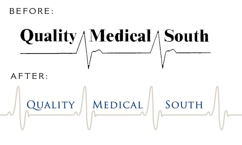
Perceptivity Studio teamed up with Contact Media to create a new identity and marketing materials for Quality Medical South, a biomedical equipment repair and service company.

Quality Medical South liked the concept of their existing logo but it needed a bit of a makeover. We refreshed the heart monitor graphic, type treatment and color palette while still maintaining the integrity of the original design.


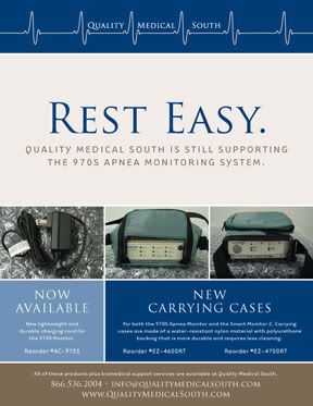
Once the logo had been updated, we worked with them on a new website design and sell sheet design for their individual product lines. The new website, www.QualityMedicalSouth.com, just went live.


The sell sheet design has a similar look and feel to the new website, while presenting the information in a simple, easy to read format.

Friday, October 10, 2008

A More Sophisticated Yellow Tag: Best Buy Gets a New Logo

I just read on the Brand New blog this morning that Best Buy is in the process of re-branding themselves with a new, more sophisticated logo. There's quite a bit of debate over at Brand New about whether Best Buy's new logo was a good idea or not, and I'm still a bit undecided myself.

As I said in my comment over there, my initial reaction was positive. From an aesthetic standpoint, the new Best Buy logo is certainly an improvement...from a practical standpoint I'm still making up my mind.

It's certainly hard to ignore the screaming yellow price tags currently adorning all of Best Buy's stores, but will we really not notice the new yellow-outlined tag just because it's not screaming as loud? The big-box Best Buy stores will still probably be painted bright blue, and the yellow is still there, just not "highlighter" yellow. I'm guessing the new Best Buy signs will all be in neon, a la the photos from the new Mall of America storefront where the new logo was launched.

It's still going to be obvious that this is Best Buy, and I don't think people will notice them less because of their new logo.

In our Great Logo quiz back in May, Best Buy was one of the logos we looked at. Here's what I had to say back then:

This logo has been around since 1989, and literally screams the company's main benefit (you will get the "best buy" by shopping here) loud and clear in eye-catching yellow and black. In Best Buy's highly competitive retail environment, this bold color combination may be a good idea. However, just because it's bold doesn't mean people will automatically pay attention, so think about colors that make sense for your company before automatically picking the loudest ones.

I said it then and I say it now. Maybe it's not such a bad idea to stop screaming at your customers. Let's see how Best Buy's new logo plays out once it's officially launched.