Tuesday, May 27, 2008

The Great Logo Quiz

Two of our favorite things to do at Perceptivity Studio are develop logos and brand identities for new companies and refine or redevelop existing logos to re-brand existing companies. Why? Logos are fun! They are an artistic representation of what a company stands for, and are often help form the first impression a customer makes when interacting with the company. And while great logos aren't single-handedly responsible for a company's success (there are so many other variables that must be in place for that to happen), they can certainly help a company project a professional image to their customers.

So to get you thinking about logos and what they stand for, here is a quiz that presents two similar logo options for a series of 10 well-known companies...one that is the correct logo, and one that very well may trick you. Write down your answers, then scroll down to the next post to see if you were right. Plus learn a bit more about some of the elements Perceptivity Studio always thinks about when starting new identity projects with our clients. Have fun, and good luck!

1. Pepsi Logo


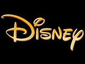
2. Disney Logo


3. Target Logo


4. Starbucks Logo


5. Domino's Pizza Logo


6. Nabisco Logo


7. Best Buy Logo


8. Wendy's Logo


9. Ocean Spray Logo


10. CBS Logo


Scroll down to the next post for the answers!

The Great Logo Quiz: Answers

WARNING, ANSWERS ARE BELOW!
If you haven't already read the questions, go to the Blog Archive on
the right side of the page and select "The Great Logo Quiz" from the list.


1. Pepsi Logo

The real Pepsi logo has red on the top and blue on the bottom. Whether you got this one right or wrong, you probably recognized the all-American color palette that Pepsi has used since 1941, when their colors were changed to red, white and blue to support the war effort. Color is a very important part of a company's brand identity, and we'll talk more about it throughout the results.


2. Disney Logo

There are no Mickey Mouse ears in the real Disney logo, though the mouse ears are perhaps one of the most recognizable symbols of this company. The Walt Disney logo is a ‘stylized version of the founder’s signature’ that represents the light-hearted image of this American entertainment icon. Script logos can be a fun addition to a company's logo. While they're not for everyone, script or handwritten typefaces can add a touch of whimsy, elegance or laid-back flair to the right kind of company. We'll talk a bit more about fonts later in the results, so read on!


3. Target Logo


The real Target logo has fewer concentric circles. This extremely simple logo design is direct and to the point, and serves as an extremely recognizable symbol of this increasingly popular symbol of cheap chic (come on, admit to calling it Tar-jhay, everyone does!). This just goes to show that you don't have to have a terribly complicated logo to have an effective logo. The red target symbol is an obvious link to the company's name. When we work with customers on new logos, we always brainstorm symbols that could visually represent their companies. Sometimes they are obvious (like the target for Target), while sometimes they are more indirect, but still create a sophisticated visual link.


4. Starbucks Logo


The real Starbucks logo has stars between the words. Speaking of Starbucks, have you heard about the controversy with the attempted new Starbucks logo? Facing opposition from conservative interest groups, they've attempted to clean up their act a bit. It's a very interesting study of brand identity, and while I wonder why they would bother making changes to a logo that holds such high brand recognition, it has definitely brought the company into the spotlight. They do say there's no such thing as bad press, right?


5. Domino's Pizza Logo

The real Domino's Pizza logo has a total of 3 dots. Ever wonder what those three dots stand for? According to the Domino's website, they represent the first three Domino’s stores. At the time, the plan was to add a dot for every new store. Obviously, that plan ran out of steam (or, more appropriately, space). But having some symbolism behind your logo (whether people "get it" right off the bat, or whether it's something only you will ever know about) can be a great way to develop a symbol that uniquely represents your company.


6. Nabisco Logo


The real Nabisco logo lives in the top left corner of its products, not the lower right. According to the Wikipedia article, this logo is known as the "Nabisco Thing." It has been claimed in company promotional material to be an early European symbol for quality. It's also been cause for controversy as people have interpreted occult meanings for the symbol. True or not, it goes to show that you should always try to think about a logo from multiple perspectives!


7. Best Buy Logo


The real Best Buy logo is designed to look like a price tag, not a perfect rectangle. This logo has been around since 1989, and literally screams the company's main benefit (you will get the "best buy" by shopping here) loud and clear in eye-catching yellow and black. In Best Buy's highly competitive retail environment, this bold color combination may be a good idea. However, just because it's bold doesn't mean people will automatically pay attention, so think about colors that make sense for your company before automatically picking the loudest ones.


8. Wendy's Logo

The real Wendy's logo, which features an illustration of Dave Thomas's little girl Wendy (now grown up), does not have swirls extending beyond the square base. Wendy serves as a very recognizable "spokeperson" for the fast food chain, and an animated Wendy even touts products in their newest ad campaign. This logo even inspired a protest from redheads in New York, which was all in good fun (at least I hope so!).


9. Ocean Spray Logo

The real Ocean Spray logo has only two wave breaks and a more vibrant color palette. As we've mentioned previously, color can play an important role in a logo, and the color palette in your brand identity should represent your industry, company philosophy and yes, your personal preferences too. It's one of the variables we like to talk to our customers about when we're starting an identity project, and we like to choose colors that are the best fit for all of those variables.


10. CBS Logo

The real CBS logo uses a serif font, not a sans serif font. The typeface is also a very important part of your logo, and while there are a few general "rules" associated with the different kinds of type (for example, serifs are generally more professional, sans serifs a bit more casual), it really depends on how the type is manipulated to evoke the image you are trying to project for your company. We like to talk about this brand image with our logo customers to get a feel for the different type solutions we can offer them, and always give a few different options to help them visualize different directions their logo can take them.


So how did you fare on the Great Logo Quiz? Was it harder than you thought it would be, or are you now a confirmed logo expert? Post your score in the comments section, or just let us know what you thought about this quiz.

Are you ready to start an identity project with Perceptivity Studio? Email us at info@perceptivitystudio.com, and we'll be in touch soon!

Tuesday, May 13, 2008

Bacon Group Architecture Website


Perceptivity Studio is proud to reveal the new Bacon Group website, launched today! The website is the final element of the re-branding process we started with this architecture company last year with a new logo, corporate identity materials and brochures, followed by a new trade show booth, proposal design and now the new website.

We wish Bacon Group continued success as their new corporate identity enters cyberspace.

Visit their website to see more of the website revamp and learn more about their company.

Monday, May 12, 2008

A "Green" Message from Engineering Matrix

Sustainable, or "green," building, is a hot topic in the construction world, and Engineering Matrix has been on top of the trend for quite some time now. Perceptivity Studio helped them create a direct mailer to make their clients and consultants more aware of their experience with LEED projects, including the high-tech, environmentally friendly dorms in the Eckerd College Iota Complex.


This was the second postcard in their direct mail campaign. The first postcard talked about their security system design services.


To learn more about green building, visit the U.S. Green Building Council website, and to learn more about Engineering Matrix, visit their website. We congratulate Engineering Matrix for creating healthier environments for the people who inhabit their buildings, and a better outlook for the planet on which we live.

Thursday, May 8, 2008

Welcome Kendall!

After designing the invitations for Lauren's baby shower, I was excited to create the birth announcement when her daughter Kendall arrived. We kept a similar feel to the shower invitation with several shared elements, but made the birth announcement a bit softer and more feminine.

Here is the birth announcement:


Here is the shower invitation:

Thursday, May 1, 2008

Happy Anniversary to Venue!

Congratulations to Perceptivity Studio client Venue on their first anniversary. After initially creating the logo and identity materials last year for this cost & project management consulting company, Perceptivity Studio created an anniversary postcard announcing this great achievement for their company to clients and vendors.


Their tagline, "the bottom line" was used as a way of saying thank you to those who helped make them successful, and ghosted project names highlight the various projects they've worked on throughout the year.

Quite the international company, Venue's postcards are on their way not only throughout North America, but also throughout Europe and as far as Australia, Japan and Bahrain.

Visit Venue's website today to learn more about the dynamic Ryan duo of Sean and Steve, and see some of the incredible projects they've helped make a reality. Venue specializes in estimating costs for performing arts venues (hence the name), and they've laid the groundwork for some truly spectacular projects.

Congratulations again on this huge accomplishment, and we look forward to working with YOU for many years to come.